I've done a little more
work with my graphics library, following a few threads:
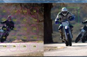
- Recent efforts to auto-process photos for web publishing.
- Expansion of my code base, including use of Java parallel streams.
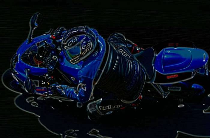
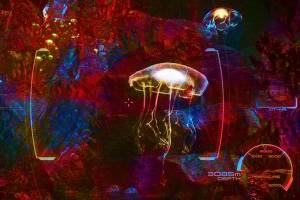
- Image stylization. Historically I've been experimenting with neural networks, but there's a lot that can be done with algorithms and rngs.
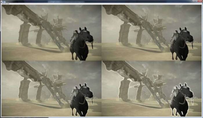
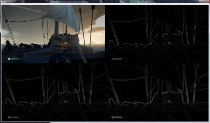
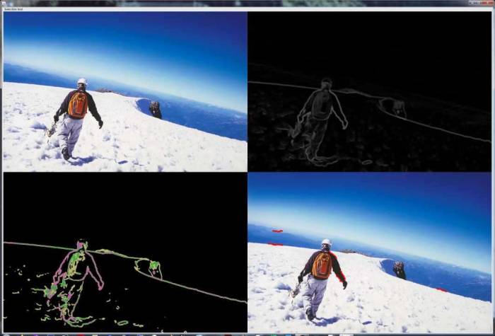
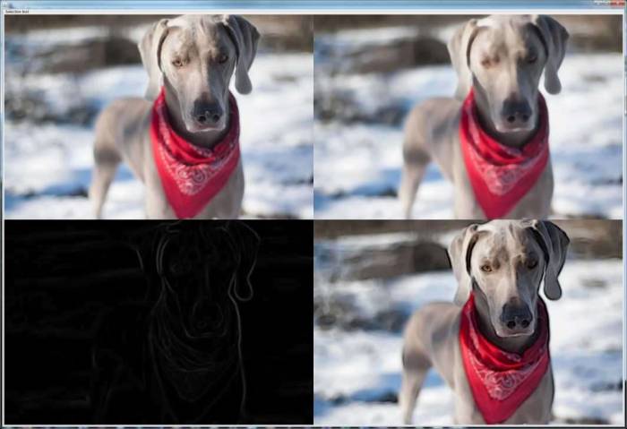
Important: you have to click through on a lot of these images to see what's going on. Even then, keep in mind it's a 50% compressed jpg scaled down to about 1000 pixels on the longest side.
Sampling
Rather than clicking through a file chooser every time, I finally started building a
directory of sample photos and screenshots. They're primarily portrait-ish but have a decent variety in most other graphical aspects.
Implementation fundamentals
I didn't have a set goal here, but rather meandered about, implementing bits of functionality based on
three primary image processing components:
- Canvas: a raster image sort of like BufferedImage, but with the features and interoperability I need.
- Selection: a collection of coordinates that resembles selections in Photoshop or Paint. This is how I might, say, define a box for a median filter or an arbitrary selection of similar values.
- Brush: a transform that occurs on a selection of a Canvas. This would be like a median filter (box, circle, or other) or an assignment to a given value.
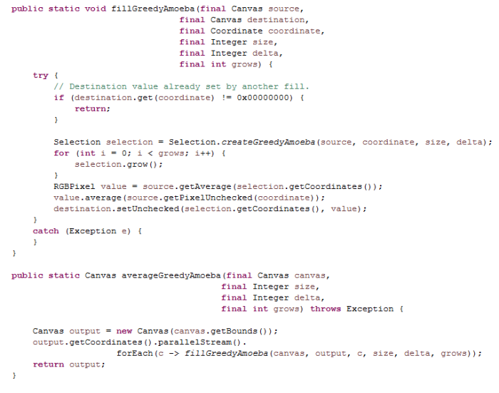
The selection + brush operations can be parallelized easily using parallelStream().
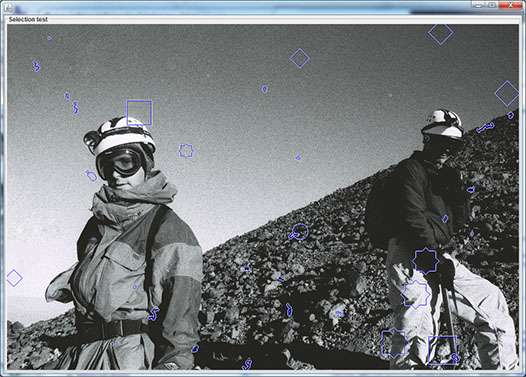
Basic selections shapes include a circle, box, diamond, and a (box + diamond) star that approximates a circle with no floating point garbage.
Additionally, there are
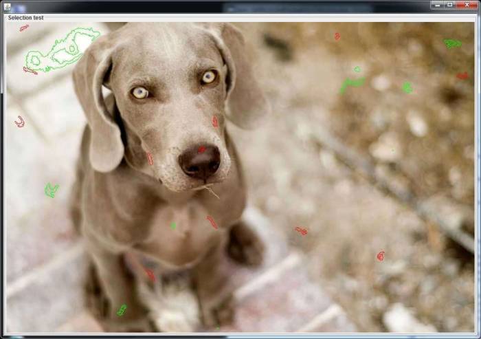
content-sensitive shapes that might grow and shrink based on, say the similarity of their contents. Side note, jpg compression makes single-pixel selections look bad.
                              *
                          * * x * *
                      * * x x o x x *   *
                    * x x o o o o o x * x * * *
                  * x o o o o o o o o x o x x x *
                * x o o o o o o o o o o o o o o x *
              * x o o o o o o o o o o o o o o o o x *
            * x o o o o o o o o o o o o o o o o o o x *
            * x o o o o o o o o o o o o o o o o o o x *
            * x o o o o o o o o o o o o o o o o o o x *
          * x o o o o o o o o o o o o o o o o o o o o x *
            * x o o o o o o o o o o o o o o o o o o x *
            * x o o o o o o o o o o o o o o o o o o x *
            * x o o o o o o o o o o o o o o o o o o x *
              * x o o o o o o o o o o o o o o o o x *
                * x o o o o o o o o o o o o o o x *
                  * x o o o o o o o x x o x x x *
                    * x x x o x x x * * x * * *
                      * * * x * * *     *
                            *
Sometimes you need to dump a selection as text to debug.
So if I wanted to do a median filter, I could
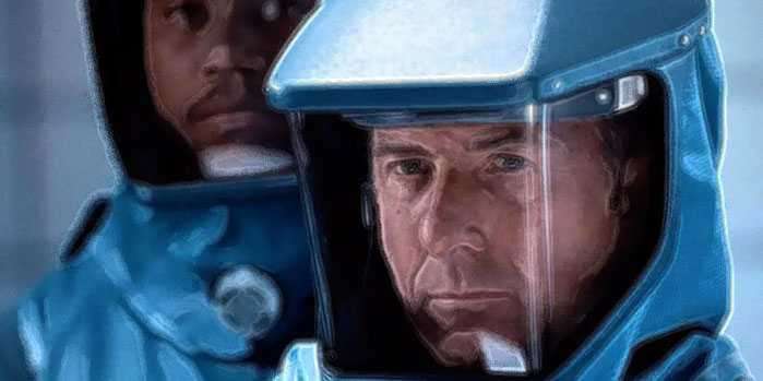
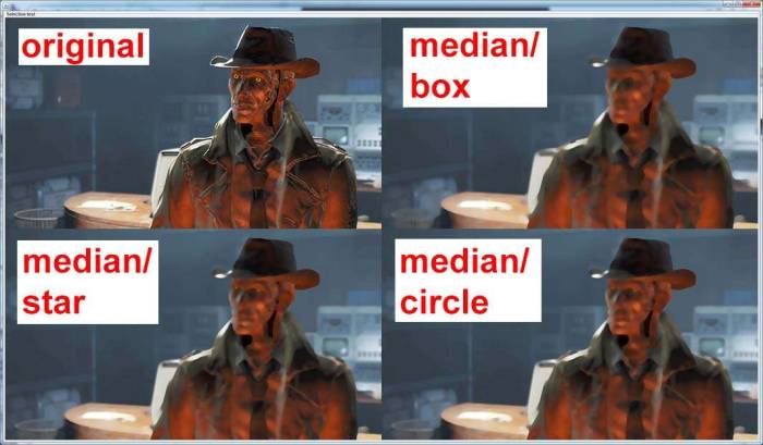
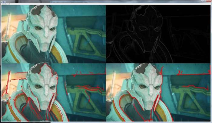
define that brush and then apply it to the selection shape I wanted. As you can see above, a rounder filter can preserve some detail, such as Nick Valentine's eyes.
And while a naive median filter distorts edges into simple shapes, by using a content-sensitive selection, an
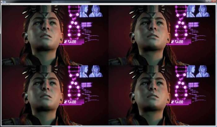
average filter can provide an airbrush effect. And by content-sensitive, here I mean it only operates on regions that have similar contents.
Edges
Deltas
Edges are both simple and complex.
Dragging a box filter across an image is pretty standard, but it has its shortcomings.
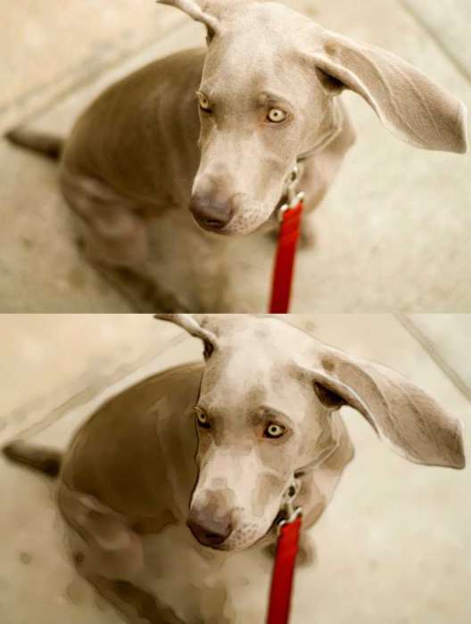
So if I wanted to make this image of a helicopter dog pop more,
it'd be neat to trace the outline of his head and ears. (Side note: this disgusts me as a photo enthusiast, photos shouldn't be subjected to instagram filters). Since Kafcopter is the color of cement, we only see definition on part of his schnozz and can't easily get our outline. Depth of field also shows that blurred edges largely escape a naive edge filter.
For 'delta' I primarily used
absolute delta between R/G/B between given pixels in a sample. For edge value, I experimented with the max delta between any pixels in a given area as well as the average delta. Of course, these yield different ranges of values that then have to be applied in some way (lighten/darken).
Sampling radius can change what you find and increase the effective edge width.
Almost every sample from an image has a delta of some sort, so truncating low end values reduces the noise introduced to the image. Taking this further,
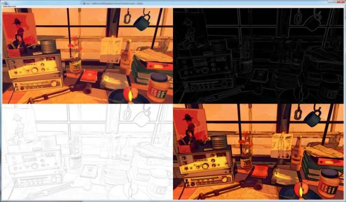
I might consider an edge to be a 0/1 type of thing, do I set a threshold and move edges to black/white? Maybe, though being a bit less drastic and binning the results provides a smoother output. In the above example, the top right is the basic edge values, the lower left bins them into four levels with each level getting assigned pink/yellow/green.
Applying a
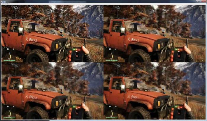
median filter before looking for edges seems to increase smoothness and reduce the very thick edges that result from dense patches of contrast.
Tracing
The question remains: how do I find edges that exist between similarly-colored surfaces? One idea that I haven't implemented is to normalize contrast by the average value in the region. This would ensure that any region would have edges and elevate the mild edges to match the more distinct ones. I tried out another approach: tracing. Iteratively land somewhere on the image, find the highest delta, then
greedily follow the next point of highest delta until some limit is reached. On the plus side, it gives an "edge/no edge" result, rather than a "maybe this is an edge". But, like any heuristic, it can be fooled.
Stylization
So in addition to having a
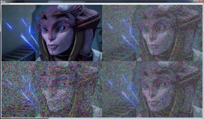
blob/amoeba that grows by eating up similar pixels, I have a snake. It behaves similarly, but each added pixel cannot border two already in the set. I wasn't sure what it'd lead to, but it was a pretty simple variation on the amoeba. Averaging the selections yielded by the snake gave a pixelated or canvasy texture.
With random color overlays it's easier to see the snake paths. In addition to wanting to eat between i and j pixels, the snake can grow outwardly any number of times after its done.
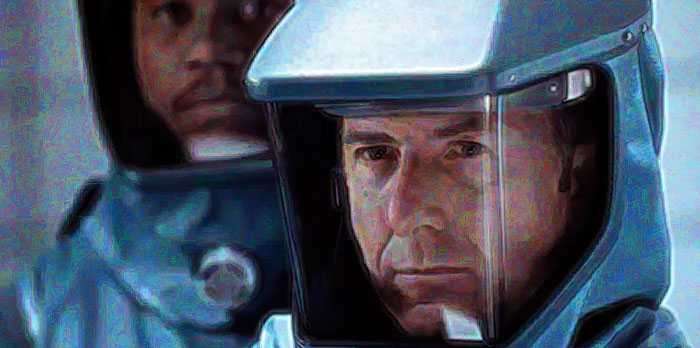
As with all photo editing, a light touch yields more pleasing results.
Practical stuff
Intensity| Count
------------------
[0-15]   : 0
[16-31]  : 0
[32-47]  : 125623
[48-63]  : 92466
[64-79]  : 28560
[80-95]  : 21877
[96-111] : 27980
[112-127]: 33803
[128-143]: 74421
[144-159]: 74666
[160-175]: 40697
[176-191]: 23501
[192-207]: 32142
[208-223]: 36658
[224-239]: 38027
[240-255]: 45899
Histograms are a common thing for photo editing, going back to the dark room and
ensuring your print had max black and almost max white. This can equally apply to filter effects, so I implemented a very basic pixel value (brightness) correction. Using the delta to 0x000000 and 0xffffff, the algorithm 'stretches' each pixel toward either end. The middle is the median of the existing histogram, then as you walk away from the middle, you increasingly add to the pixel value until at the end you're adding the rest of the gap.
The results were pretty easy to test: take an image, mess up the histogram, run the algorithm on it. In this case, it was given max white, but no max black pixels. The correction appears to lose some saturation, but that's not a difficult thing to fix.
And the other way: in addition to not regaining saturation, the restored image is contrastier than the original.
Lastly, if the image is center-biased without either end. Saturation, again.
The road ahead
I have a lot of brushes to code up. Then effects to stack.
Some posts from this site with similar content.
(and some select mainstream web). I haven't personally looked at them or checked them for quality, decency, or sanity. None of these links are promoted, sponsored, or affiliated with this site. For more information, see
.

